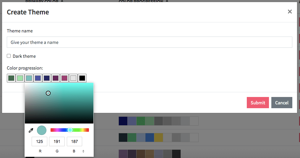
We are happy to introduce Dear Lucy custom color themes! You can build your own color theme to match your brand colors, or even create multiple color themes for different business units, teams, or topics. Read on to learn how to customize the look & feel of your dashboards.
Dear Lucy team has always loved beautifully designed, intuitive software. From the early days of Dear Lucy, we have always had one guiding principle: create software that people love to use and that can brighten up their day.
We are thrilled to announce that you are now able to take your Dear Lucy to a totally different level. You can create your own custom color themes to match your company brand or create different themes to match various topics, business units, or teams.
In addition to custom colors, you can even add your own background images or videos to brighten up your dashboards.
Creating Your Custom Color Themes
Creating your own custom theme is quite simple. The basic steps are as follows:
Pick a dark or light theme. The default in custom themes is the light mode but if you are looking for a clearly darker look and feel, the dark theme might work better.
Define your chosen colors. You can choose up to nine colors for your own color theme.
Name your theme. You can create several custom themes so give them a unique name to help your team know which one to use.
Test it on a dashboard. Test your dashboard with your new colors. If it does not quite work on the first go, you can always adjust the colors in the theme.
For more detailed instructions, visit our Support-pages on how to create custom color themes.
Please note that in order to make changes to the color themes, you need to have admin rights to your company’s Dear Lucy.
Dear Lucy’s Own Design Themes
If you don’t quite trust your designer skills, you can always opt for Dear Lucy’s own color themes. The Dear Lucy themes have been designed to work especially well on dashboards with contrasting colors that make it easy to visualize data sets.
The color themes to choose from are:
Aubergine - dark purples and browns
Black - a dark theme with various shades of grey
Coffee bean - natural shades of coffee and aubergine
Deep fir - green theme with various shades of green
Imperial - bold pinks, purples and petrol green
Mardi gras - cool purples, pinks and blues
Midnight - a selection of blues
Mulberry wood - dark maroon and a selection of purples
Stratos - think of blue and grey skies
Clouds - strong pinks and purples contrasted with white
Silver - same as clouds but with a hint of grey
Change The Background Image
To bring even more life to the Dear Lucy reporting views, you can also change the background images of Dear Lucy dashboards.
It is a bit difficult sometimes to estimate how a particular color theme and background image combination works, so the best is to play around and test different combinations to achieve your desired look & feel.
Use a Video Background on Dashboards
For some situations, you may want a plain and simple dashboard that focuses on numbers and data as clearly as possible and want no distractions from the actual figures.
For other use cases - for example when displaying dashboards on the office wall - a more lively dashboard may be called for. In that case, you may want to consider adding a live video background to the dashboard,
Whatever your wishes are, Dear Lucy is a flexible solution that can meet your needs.
Interested?
Dear Lucy sales dashboards can be customized in many ways to suit your team’s needs. Contact us for inspiration and help.


