
Salesforce is an excellent platform for CRM but less so for deep, sophisticated business intelligence and reporting. While Salesforce’s native reporting tool can be sufficient for basic CRM reporting and data extraction, it has significant limitations in terms of flexibility, ease of use, and advanced features required for more complex sales analytics.
In this blog post, we briefly discuss the biggest limitations of Salesforce’s native reporting capabilities, after which we’ll show some of the most popular advanced Salesforce dashboards in Dear Lucy, a sales reporting tool purpose-built for reporting inside the Salesforce user interface.
Limitations in Salesforce’s Native Reporting Capabilities
Salesforce’s native reporting capabilities are adequate for simple reporting needs, but they do have some limitations that users frequently encounter. Some of the most common limitations include:
Limited Cross-Object Reporting
Native Salesforce reports are primarily designed to pull data from a single object at a time. If you need to report across multiple objects (e.g., accounts, contacts, opportunities), it’s challenging without using complex relationships like “report types” or custom objects.
No Support for Hierarchical Reporting
Salesforce struggles with more complex hierarchical reporting, where you need to easily view data in a tree-like or multi-level format. The native reporting capabilities aren’t as intuitive or powerful for visualizing hierarchical data (like parent-child relationships) compared to specialized reporting tools.
Limited Target-Setting and Tracking Functionality
Salesforce’s native goal-setting features work well for tracking performance against predefined sales targets, but the functionality is somewhat limited when it comes to flexibility, complexity, and cross-departmental alignment. For companies that need more advanced goal-setting features (like complex calculations, targets for a variety of sales activities or pipeline metrics, or tracking goals throughout all levels of the sales organization), a third-party tool might be necessary.
Restrictive Data Visualization Options
The out-of-the-box visualizations in Salesforce reports are fairly basic. While Salesforce does offer charts within reports, the customization and design options for visuals are relatively limited compared to more specialized Salesforce reporting tools.
Lack of Advanced Customization
Although Salesforce provides a range of report formats (Tabular, Summary, Matrix, and Joined reports), customizing the appearance and layout of reports is often limited. Users can’t, for example, fully customize how fields and values appear or change the design as extensively as some other reporting tools would allow.
7 Examples of Advanced Salesforce Dashboards
Next, let’s take a look at some advanced Salesforce dashboards in Dear Lucy, a sales performance management tool with a native integration to Salesforce.
1. Goal-Setting and Automated Progress Tracking
Setting goals is one thing, but to make those targets actionable, sales leaders, managers, and reps need to be able to easily track their progress against those goals on a daily basis.

Dear Lucy takes target-setting in Salesforce one step further, by allowing you to set personalized goals and targets for individual sales reps, teams, regions, business units, or entire sales organizations. These goals are typically aligned with specific KPIs such as revenue targets, quota, pipeline coverage, number of calls, meetings, deals closed, or win rate.
Dear Lucy automatically tracks daily attainment against the goals, making it easy for the sales leadership to make data-driven decisions, and for individuals and teams to ramp up activity when they’re falling behind on their meeting or pipeline targets for the period.
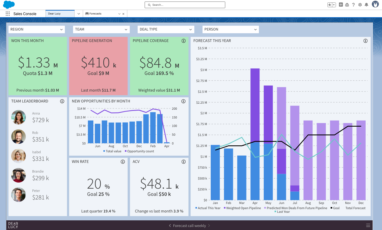
2. Pipeline and Opportunity Tracking
Sales leaders are often looking for more advanced dashboards focused on pipeline health, allowing them to quickly assess the stage of opportunities, identify bottlenecks, and monitor the flow of deals through the sales cycle. These dashboards help in tracking pipeline generation, pipeline coverage, deal velocity, win/loss ratios, and sales cycle length.

With Dear Lucy, you can create advanced pipeline reports that contain not only historical data comparing current pipeline to the previous period but also your targets and actuals.
3. AI-Based, Predictive Opportunity Scoring
Dear Lucy’s predictive opportunity scoring for Salesforce enhances how sales teams manage their pipeline by providing actionable insights, prioritizing opportunities, and improving forecasting accuracy. Unlike Salesforce’s standard scoring, Dear Lucy offers customizable scoring models that are tailored to each business's specific sales dynamics, with real-time updates and data-driven insights.

Dear Lucy’s integration within Salesforce ensures seamless access to these insights without the need for external tools. The platform empowers sales teams to focus on high-priority opportunities, mitigate risks, and align team efforts, ultimately driving smarter growth and improved sales outcomes.
4. Sales Leaderboards
To do their jobs effectively, Sales Managers and Directors need dashboards that let them compare individual sales reps and/or teams against each other, with metrics like deals closed, revenue generated, and target attainment. These dashboards can provide visibility into top performers and identify concrete areas of improvement.
Dear Lucy allows you to quickly build leaderboards for any metrics that matter to you, whether you’d like to track activity, pipeline, bookings, or all of them. This can be done for both individuals and teams.
5. Sales Rep Activity Tracking for Account Executives and Managers
Every Account Executive and Sales Manager knows that ultimately, sales is a numbers game. By working back concrete targets from revenue to required pipeline, meetings, and outbound activities, reps and their managers are able to keep track of performance throughout the month or quarter, making it easy to course-correct before it’s too late.

Dear Lucy’s sales performance dashboards offer a clear view of required vs. actual performance for key metrics like meetings, new opportunities, proposals, and won deals. This helps sales reps and managers quickly identify areas where they are on track and where additional focus is needed.
6. Recurring Revenue Dashboard for Tracking ARR and MRR
SaaS and subscription companies need to be able to create advanced revenue reports about recurring revenue (annual recurring revenue or ARR and monthly recurring revenue or MRR), as they provide insights into stable, predictable income. However, Salesforce makes it difficult to track recurring and non-recurring revenue in the same chart, forcing finance teams to piece together custom reports.

Dear Lucy makes tracking recurring revenue easy for Salesforce users. It automatically pulls deal data, calculates key metrics, and visualizes revenue trends.
7. CRM Data Hygiene Dashboard aka The Wall of Shame
The one advanced sales dashboard that most sales leaders and Revenue Operations Managers haven’t even dared to dream of is a CRM data hygiene dashboard to tell them exactly what data is missing from their Salesforce and who’s responsible for updating it.

The “Wall of Shame” dashboard in Dear Lucy ranks sales reps based on missing data entry tasks and motivates them to keep their CRM up to date.
For more example Salesforce dashboards, check out out interactive dashboard gallery.
How to Create Advance Salesforce Reports in Minutes with Dear Lucy
Getting access to all of the aforementioned advanced Salesforce dashboards — and more — is easy. Here are the steps you can follow to get started:
Connect your Salesforce data to Dear Lucy in one click.
Your data will automatically populate into our most popular dashboard templates.
Once your data is flowing into Dear Lucy, you can easily embed any dashboards you want into Salesforce with a few clicks.
If you’d like to see example reports before connecting your own data, you can click through our gallery of interactive sales dashboards or schedule time with one of our product experts.
Get advanced Salesforce dashboards in minutes
Sign up for your free 10-day trial of Dear Lucy today. Connecting your data only takes one click, and our example dashboards will start populating with your data immediately.